
 Seaborn库绘制了17个超好看图表

# Seaborn简介
# 定义
Seaborn是一个基于matplotlib且数据结构与pandas统一的统计图制作库。Seaborn框架旨在以数据可视化为中心来挖掘与理解数据。
# 优点
代码较少
图形美观
功能齐全
主流模块安装
# pip命令安装
`pip install matplotlib
pip install seaborn`
1
2
2
# 从github安装
`pip install git+https://github.com/mwaskom/seaborn.git`
1
# 流程
# 导入绘图模块
`mport matplotlib.pyplot as plt
import seaborn as sns`
1
2
2
# 提供显示条件
`%matplotlib inline #在Jupyter中正常显示图形`
1
# 导入数据
`#Seaborn内置数据集导入
dataset = sns.load_dataset('dataset')

#外置数据集导入(以csv格式为例)
dataset = pd.read_csv('dataset.csv')`
1
2
3
4
5
2
3
4
5
# 设置画布
`#设置一块大小为(12,6)的画布
plt.figure(figsize=(12, 6))`
1
2
2
# 输出图形
`#整体图形背景样式,共5种:"white", "dark", "whitegrid", "darkgrid", "ticks"
sns.set_style('white')

#以条形图为例输出图形
sns.barplot(x=x,y=y,data=dataset,...)

'''
barplot()括号里的是需要设置的具体参数,
涉及到数据、颜色、坐标轴、以及具体图形的一些控制变量,
基本的一些参数包括'x'、'y'、'data',分别表示x轴,y轴,
以及选择的数据集。
'''`
1
2
3
4
5
6
7
8
9
10
11
12
2
3
4
5
6
7
8
9
10
11
12
# 保存图形
`#将画布保存为png、jpg、svg等格式图片
plt.savefig('jg.png')`
1
2
2
# 实战
`#数据准备
df = pd.read_csv('./cook.csv') #读取数据集(「菜J学Python」公众号后台回复cook获取)
df['难度'] = df['用料数'].apply(lambda x:'简单' if x<5 else('一般' if x<15  else '较难')) #增加难度字段
df = df[['菜谱','用料','用料数','难度','菜系','评分','用户']] #选择需要的列
df.sample(5)  #查看数据集的随机5行数据`
1
2
3
4
5
2
3
4
5

`#导入相关包
import numpy as np
import pandas as pd
import matplotlib.pyplot as plt
import matplotlib as mpl
import seaborn as sns
%matplotlib inline
plt.rcParams['font.sans-serif'] = ['SimHei']  # 设置加载的字体名
plt.rcParams['axes.unicode_minus'] = False    # 解决保存图像是负号'-'显示为方块的问题
sns.set_style('white')   #设置图形背景样式为white`
1
2
3
4
5
6
7
8
9
10
2
3
4
5
6
7
8
9
10
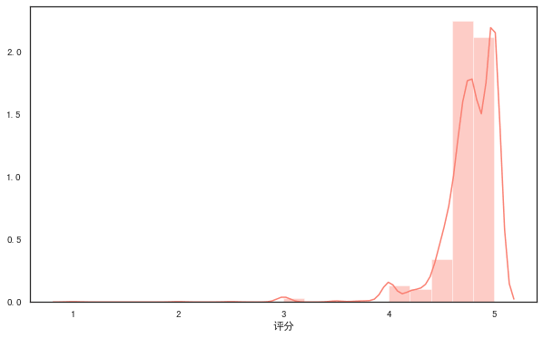
# 直方图
`#语法
'''
seaborn.distplot(a, bins=None, hist=True, kde=True, rug=False, fit=None,
hist_kws=None, kde_kws=None, rug_kws=None, fit_kws=None, color=None,
vertical=False, norm_hist=False, axlabel=None, label=None, ax=None)
'''

#distplot()输出直方图,默认拟合出密度曲线
plt.figure(figsize=(10, 6)) #设置画布大小
rate = df['评分']
sns.distplot(rate,color="salmon",bins=20) #参数color样式为salmon,bins参数设定数据片段的数量`
1
2
3
4
5
6
7
8
9
10
11
2
3
4
5
6
7
8
9
10
11
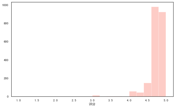
`#kde参数设为False,可去掉拟合的密度曲线
plt.figure(figsize=(10, 6))
sns.distplot(rate,kde=False,color="salmon",bins=20)`
1
2
3
2
3
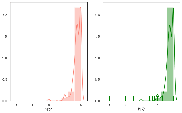
`#设置rug参数,可添加观测数值的边际毛毯
fig,axes=plt.subplots(1,2,figsize=(10,6)) #为方便对比,创建一个1行2列的画布,figsize设置画布大小

sns.distplot(rate,color="salmon",bins=10,ax=axes[0]) #axes[0]表示第一张图(左图)

sns.distplot(rate,color="green",bins=10,rug=True,ax=axes[1]) #axes[1]表示第一张图(右图)`
1
2
3
4
5
6
2
3
4
5
6
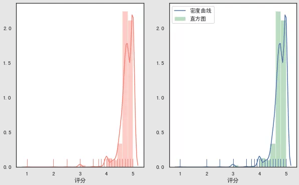
`#多个参数可通过字典传递
fig,axes=plt.subplots(1,2,figsize=(10,6))
sns.distplot(rate,color="salmon",bins=20,rug=True,ax=axes[0])

sns.distplot(rate,rug=True,
                     hist_kws={'color':'g','label':'直方图'},
                     kde_kws={'color':'b','label':'密度曲线'},
                     bins=20,
                     ax=axes[1])`
1
2
3
4
5
6
7
8
9
2
3
4
5
6
7
8
9
# 散点图
# 常规散点图:scatterplot
`#语法
'''
seaborn.scatterplot(x=None, y=None, hue=None, style=None, size=None,
data=None, palette=None, hue_order=None, hue_norm=None, sizes=None,
size_order=None, size_norm=None, markers=True, style_order=None, x_bins=None,
y_bins=None, units=None, estimator=None, ci=95, n_boot=1000, alpha='auto',
x_jitter=None, y_jitter=None, legend='brief', ax=None, **kwargs)
'''

fig,axes=plt.subplots(1,2,figsize=(10,6))
#hue参数,对数据进行细分
sns.scatterplot(x="用料数", y="评分",hue="难度",data=df,ax=axes[0])

#style参数通过不同的颜色和标记显示分组变量
sns.scatterplot(x="用料数", y="评分",hue="难度",style='难度',data=df,ax=axes[1])`
1
2
3
4
5
6
7
8
9
10
11
12
13
14
15
2
3
4
5
6
7
8
9
10
11
12
13
14
15
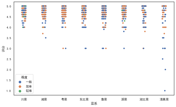
# 分簇散点图:stripplot
`#语法
'''
seaborn.stripplot(x=None, y=None, hue=None, data=None, order=None,
hue_order=None, jitter=True, dodge=False, orient=None, color=None,
palette=None, size=5, edgecolor='gray', linewidth=0, ax=None, **kwargs)
'''

#设置jitter参数控制抖动的大小
plt.figure(figsize=(10, 6))
sns.stripplot(x="菜系", y="评分",hue="难度",jitter=1,data=df)`
1
2
3
4
5
6
7
8
9
10
2
3
4
5
6
7
8
9
10
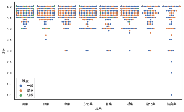
# 分类散点图:swarmplot
`#绘制分类散点图(带分布属性)
#语法
'''
seaborn.swarmplot(x=None, y=None, hue=None, data=None, order=None,
hue_order=None, dodge=False, orient=None, color=None, palette=None,
size=5, edgecolor='gray', linewidth=0, ax=None, **kwargs)
'''

plt.figure(figsize=(10, 6))
sns.swarmplot(x="菜系", y="评分",hue="难度",data=df)`
1
2
3
4
5
6
7
8
9
10
2
3
4
5
6
7
8
9
10
# 条形图
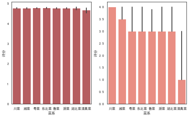
# 常规条形图:barplot
`#语法
'''
seaborn.barplot(x=None, y=None, hue=None, data=None, order=None,
hue_order=None,ci=95, n_boot=1000, units=None, orient=None, color=None,
palette=None, saturation=0.75, errcolor='.26', errwidth=None, capsize=None,
ax=None, estimator=<function mean>,**kwargs)
'''

#barplot()默认展示的是某种变量分布的平均值(可通过修改estimator参数为max、min、median等)
# from numpy import median
fig,axes=plt.subplots(1,2,figsize=(10,6))
sns.barplot(x='菜系',y='评分',color="r",data=df,ax=axes[0])

sns.barplot(x='菜系',y='评分',color="salmon",data=df,estimator=min,ax=axes[1])`
1
2
3
4
5
6
7
8
9
10
11
12
13
14
2
3
4
5
6
7
8
9
10
11
12
13
14
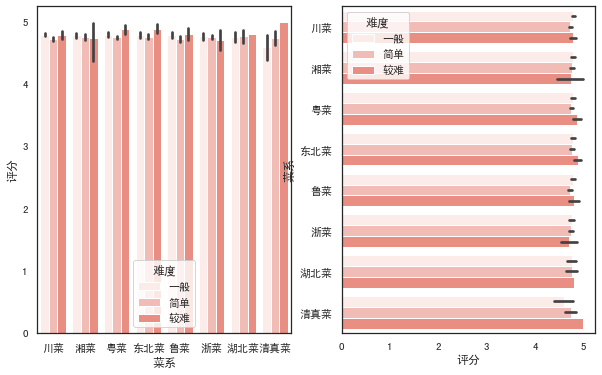
`fig,axes=plt.subplots(1,2,figsize=(10,6))
#设置hue参数,对x轴的数据进行细分
sns.barplot(x='菜系',y='评分',color="salmon",hue='难度',data=df,ax=axes[0])
#调换x和y的顺序,可将纵向条形图转为水平条形图
sns.barplot(x='评分',y='菜系',color="salmon",hue='难度',data=df,ax=axes[1])`
1
2
3
4
5
2
3
4
5
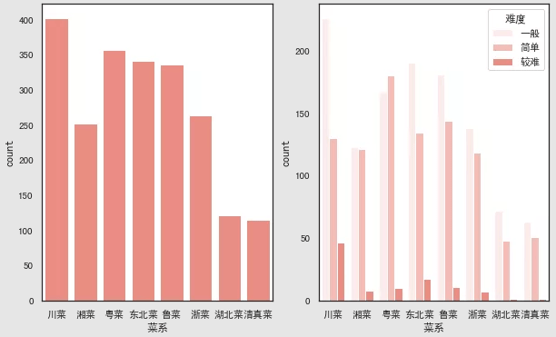
# 计数条形图:countplot
`
#语法
'''seaborn.countplot(x=None, y=None, hue=None, data=None, order=None,hue_order=None, orient=None, color=None, palette=None, saturation=0.75, dodge=True, ax=None, **kwargs)'''fig,axes=plt.subplots(1,2,figsize=(10,6))
#选定某个字段,countplot()会自动统计该字段下各类别的数目sns.countplot(x='菜系',color="salmon",data=df,ax=axes[0])
#同样可以加入hue参数sns.countplot(x='菜系',color="salmon",hue='难度',data=df,ax=axes[1])
`
1
2
3
4
5
6
2
3
4
5
6
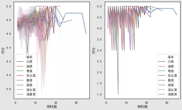
# 折线图
`#语法
'''
seaborn.lineplot(x=None, y=None, hue=None, size=None, style=None,
data=None, palette=None, hue_order=None, hue_norm=None, sizes=None, size_order=None,
size_norm=None, dashes=True, markers=None, style_order=None, units=None, estimator='mean',
ci=95, n_boot=1000, sort=True, err_style='band', err_kws=None, legend='brief', ax=None, **kwargs)
'''

fig,axes=plt.subplots(1,2,figsize=(10,6))
#默认折线图有聚合
sns.lineplot(x="用料数", y="评分", hue="菜系",data=df,ax=axes[0])

#estimator参数设置为None可取消聚合
sns.lineplot(x="用料数", y="评分", hue="菜系",estimator=None,data=df,ax=axes[1])`
1
2
3
4
5
6
7
8
9
10
11
12
13
14
2
3
4
5
6
7
8
9
10
11
12
13
14
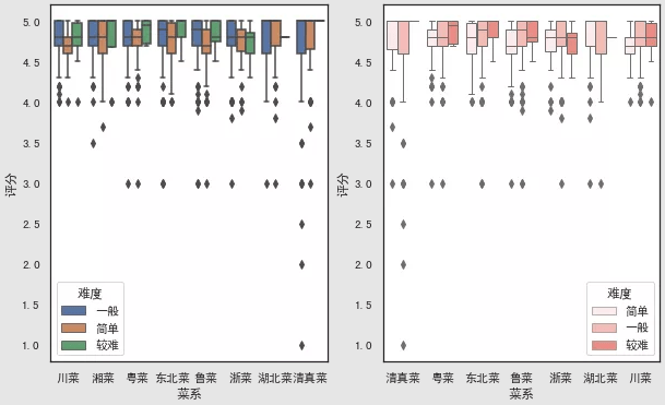
# 箱图
# 箱线图:boxplot
`#语法
'''
seaborn.boxplot(x=None, y=None, hue=None, data=None, order=None,
hue_order=None, orient=None, color=None, palette=None, saturation=0.75,
width=0.8, dodge=True, fliersize=5, linewidth=None, whis=1.5, notch=False, ax=None, **kwargs)
'''
fig,axes=plt.subplots(1,2,figsize=(10,6))
sns.boxplot(x='菜系',y='评分',hue='难度',data=df,ax=axes[0])

#调节order和hue_order参数,可以控制x轴展示的顺序,linewidth调节线宽
sns.boxplot(x='菜系',y='评分',hue='难度',data=df,color="salmon",linewidth=1,
                    order=['清真菜','粤菜','东北菜','鲁菜','浙菜','湖北菜','川菜'],
                    hue_order=['简单','一般','较难'],ax=axes[1])`
1
2
3
4
5
6
7
8
9
10
11
12
13
2
3
4
5
6
7
8
9
10
11
12
13
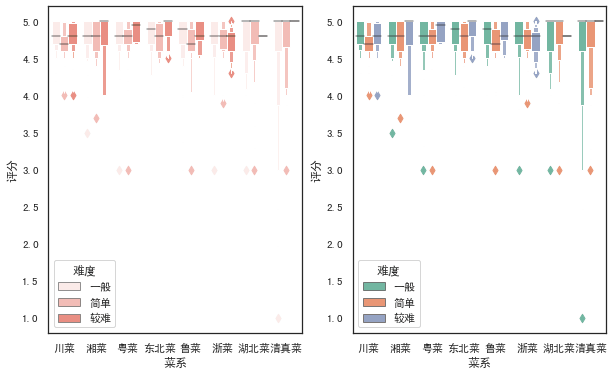
# 箱型图:boxenplot
`#语法
'''
seaborn.boxenplot(x=None, y=None, hue=None, data=None, order=None,
hue_order=None, orient=None, color=None, palette=None, saturation=0.75,
width=0.8, dodge=True, k_depth='proportion', linewidth=None, scale='exponential',
outlier_prop=None, ax=None, **kwargs)
'''

fig,axes=plt.subplots(1,2,figsize=(10,6))
sns.boxenplot(x='菜系',y='评分',hue='难度',data=df,color="salmon",ax=axes[0])

#palette参数可设置调色板
sns.boxenplot(x='菜系',y='评分',hue='难度',data=df, palette="Set2",ax=axes[1])`
1
2
3
4
5
6
7
8
9
10
11
12
13
2
3
4
5
6
7
8
9
10
11
12
13
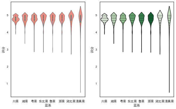
# 小提琴图
`#语法
'''
seaborn.violinplot(x=None, y=None, hue=None, data=None, order=None,
hue_order=None, bw='scott', cut=2, scale='area', scale_hue=True,
gridsize=100, width=0.8, inner='box', split=False, dodge=True, orient=None,
linewidth=None, color=None, palette=None, saturation=0.75, ax=None, **kwargs)
'''

fig,axes=plt.subplots(1,2,figsize=(10,6))
sns.violinplot(x='菜系',y='评分',data=df, color="salmon",linewidth=1,ax=axes[0])
#inner参数可在小提琴内部添加图形,palette设置颜色渐变
sns.violinplot(x='菜系',y='评分',data=df,palette=sns.color_palette('Greens'),inner='stick',ax=axes[1])`
1
2
3
4
5
6
7
8
9
10
11
12
2
3
4
5
6
7
8
9
10
11
12
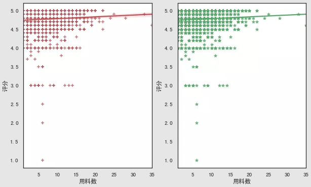
# 回归图
# regplot
`'''
seaborn.regplot(x, y, data=None, x_estimator=None, x_bins=None, x_ci='ci',
                scatter=True, fit_reg=True, ci=95, n_boot=1000, units=None,
                order=1, logistic=False, lowess=False, robust=False, logx=False,
                x_partial=None, y_partial=None, truncate=False, dropna=True,
                x_jitter=None, y_jitter=None, label=None, color=None, marker='o',
                scatter_kws=None, line_kws=None, ax=None)
'''

fig,axes=plt.subplots(1,2,figsize=(10,6))
#marker参数可设置数据点的形状
sns.regplot(x='用料数',y='评分',data=df,color='r',marker='+',ax=axes[0])
#ci参数设置为None可去除直线附近阴影(置信区间)
sns.regplot(x='用料数',y='评分',data=df,ci=None,color='g',marker='*',ax=axes[1])`
1
2
3
4
5
6
7
8
9
10
11
12
13
14
2
3
4
5
6
7
8
9
10
11
12
13
14
# lmplot
`#语法
'''
seaborn.lmplot(x, y, data, hue=None, col=None, row=None, palette=None,
               col_wrap=None, height=5, aspect=1, markers='o', sharex=True,
               sharey=True, hue_order=None, col_order=None, row_order=None,
               legend=True, legend_out=True, x_estimator=None, x_bins=None,
               x_ci='ci', scatter=True, fit_reg=True, ci=95, n_boot=1000,
               units=None, order=1, logistic=False, lowess=False, robust=False,
               logx=False, x_partial=None, y_partial=None, truncate=False,
               x_jitter=None, y_jitter=None, scatter_kws=None, line_kws=None, size=None)
'''

#lmplot()可以设置hue,进行多个类别的显示,而regplot()是不支持的
sns.lmplot(x='用料数',y='评分',hue='难度',data=df,
           palette=sns.color_palette('Reds'),ci=None,markers=['*','o','+'])`
1
2
3
4
5
6
7
8
9
10
11
12
13
14
15
2
3
4
5
6
7
8
9
10
11
12
13
14
15
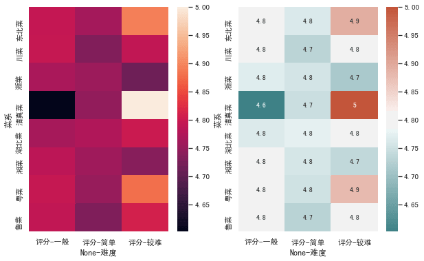
# 热力图
`#语法
'''
seaborn.heatmap(data, vmin=None, vmax=None, cmap=None, center=None,
                robust=False, annot=None, fmt='.2g', annot_kws=None,
                linewidths=0, linecolor='white', cbar=True, cbar_kws=None,
                cbar_ax=None, square=False, xticklabels='auto',
                yticklabels='auto', mask=None, ax=None, **kwargs)
'''

fig,axes=plt.subplots(1,2,figsize=(10,6))
h=pd.pivot_table(df,index=['菜系'],columns=['难度'],values=['评分'],aggfunc=np.mean)
sns.heatmap(h,ax=axes[0])

#annot参数设置为True可显示数字,cmap参数可设置热力图调色板
cmap = sns.diverging_palette(200,20,sep=20,as_cmap=True)
sns.heatmap(h,annot=True,cmap=cmap,ax=axes[1])
#保存图形
plt.savefig('jg.png')`
1
2
3
4
5
6
7
8
9
10
11
12
13
14
15
16
17
18
2
3
4
5
6
7
8
9
10
11
12
13
14
15
16
17
18
上次更新: 2024/07/25, 21:16:23